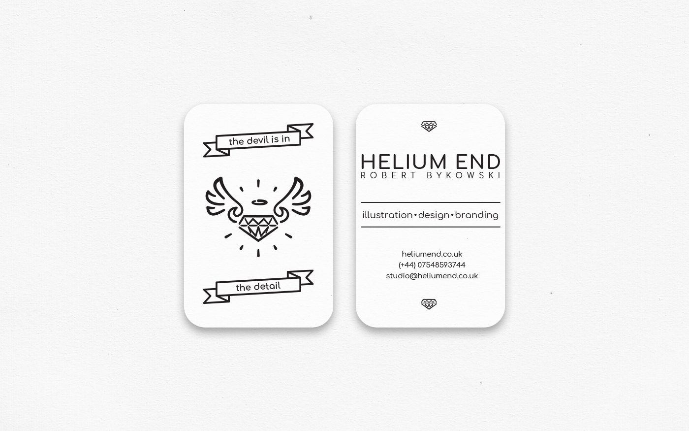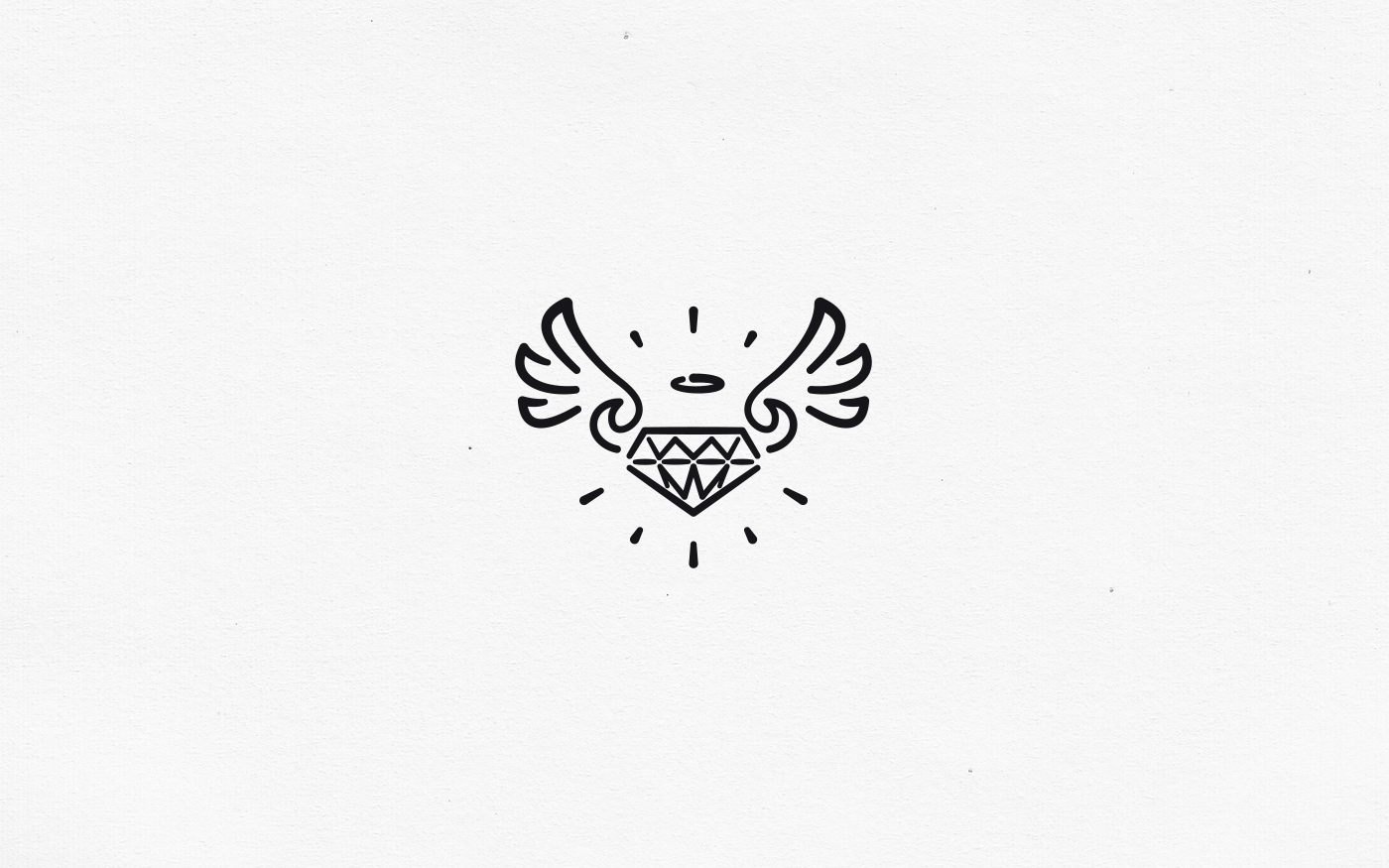
Logo and Business cards for my own company, Helium End. The logo and business cards were designed back in 2016. Key elements are taken from the original 2014 logo, cleaned up and simplified to give a modern look and feel.
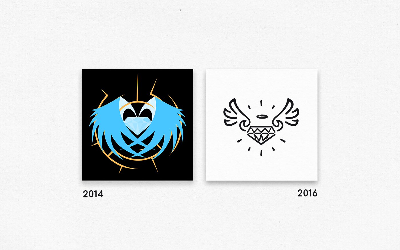
While the 2014 logo is focused on block colour, with the jewel at the centre mimicking a cut diamond, the 2016 is focused on varying line width. The 2016 logo is heavily influenced by the use of line in tattoo art and ink drawings.
A key difference between the 2014 logo and the 2016 logo is the introduction of the angel-daemon element. Through iteration of different wing designs, shapes and swirls can be used to start the wings off, such as the devil's horns. The devil's horns are blended into the wings, increasing the possibility of the horns not being seen on the first or subsequent reading. Attention can then be given by the use of the motto, "The devil is in the detail."